


6
The Impact Of Colour Psychology On Kitchen Tile Designs
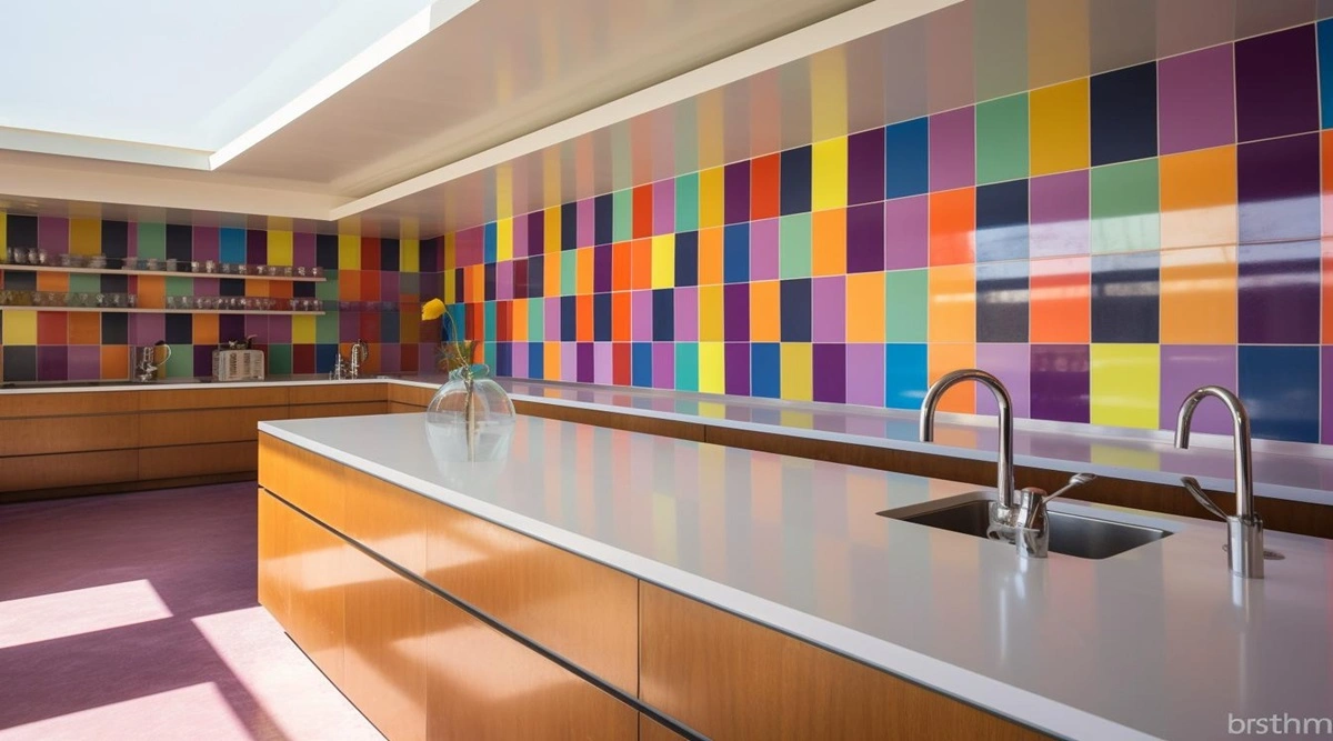
When planning the interior design or tiles for the kitchen, colour is much more than a simple and aesthetic approach. Colour psychology, which is a way of studying how colours affect our moods, whether making us happy or angry or even tempting us to overindulge or triggering lethargy, is an important feature in any interior design. We will explain how various colours of kitchen tiles affect mood, functionality, and beauty so that you can make the right decision when redesigning your kitchen.
Understanding Colour Psychology
Colour psychology looks into the ability of colour to influence the feelings and behaviour of people. They reflect the theoretical perspective, suggesting that colours cause specific feelings and may influence people’s actions. For instance, some colours put the mind at rest, while another type invigorate the senses and makes the mind wake up and work. It is when you know and implement these principles that you’ll be able to design your kitchen, depending on the mood you want and the activities in the kitchen.
Popular Colours in Kitchen Tile Design
Check out some of these popular colour choices for the kitchen and get an idea of their effect on your space and your mood.
1. White Tiles
White remains one of the most popular colours for kitchens, and it is known to make any room look neat and tidy. White tiles are preferred in the kitchen as they bounce back light instead of absorbing it, making the space look brighter and bigger. However, it is important to remember that the colour white can get stained and dirty easily, so cleanliness should be maintained constantly.
2. Blue Tiles
Blue is the most effective colour in creating a calming and soothing environment. You can design your kitchen with blue tiles to give the space a cooling effect and make it the perfect place to relax. Blue and its different shades, from light to dark, are also considered to be calming and help induce relaxation. The use of blue tiles can be complemented with white or grey colours to strengthen the calming effect of the kitchen.
3. Red Tiles
Red is a bright colour which may provoke appetite and energy in people. This colour is perfect for the kitchen tiles if you need to add a hue that will diversify the atmosphere and make it much more vibrant. Red can give the kitchen the illusion of a more lively atmosphere and encourage communication, so it is ideal for families that love cooking and eating together a lot. But if you find too much red to be bold, you can use it as one of the main secondary colours.
4. Green Tiles
Green is related to fresh feelings as well as to feelings of being close to nature. The green-coloured tiles make the kitchen very relaxing and give you a renewed feeling. In combination with natural materials, this colour is rather suitable and may help to achieve warm and friendly interior. There are different shades of green colour, ranging from mint green to forest green, thus being able to suit your personality and the atmosphere you want to create.
5. Yellow Tiles
The colour yellow tiles reduce the stress level, making the kitchen refreshing and warm. Yellow is particularly suitable in areas with little natural light since it can remind people of sunlight and have a positive impact on anyone’s mood. To avoid the excessive use and dominance of the colour yellow, you can lay the yellow tiles alongside other neutral colours.
Choosing the Right Color for Your Kitchen
Selecting the right colour for your kitchen involves considering several factors:
- Size: The size of your kitchen plays a significant role in colour choice. Lighter colours like white and pale blue can make a small kitchen feel larger, while darker colours can create a cosy and intimate atmosphere.
- Lighting: Natural and artificial lighting can affect how colours appear in your kitchen. Before finalising your tile colour, observe how it looks in different lighting conditions. For instance, certain hues may look different in natural sunlight compared to artificial light.
- Personal Preference: Ultimately, the colour you choose should reflect your personal taste and the mood you want to create. Think about how you use the kitchen and how you want it to feel.
- Combining Colours: To achieve a balanced and cohesive look, consider combining colours effectively. For example, you can pair vibrant tiles with neutral tones or use accent tiles to introduce a pop of colour without overwhelming the space.
Conclusion
The colour choices for your kitchen tiles can significantly impact the mood, functionality, and aesthetics of the space. By understanding the principles of colour psychology and considering factors such as size, lighting, and personal preference, you can create a kitchen that not only looks beautiful but also enhances your daily experiences.
Whether you are looking for the tranquillity of blue tiles, the warmth of yellow, or the energy of red, Spenza Ceramics, a leading tiles brand in India trusted by thousands has the largest collection of tiles of different colours, styles and patterns with high-grad quality ready to shape your kitchen into a space that truly feels like home.
Related Blogs

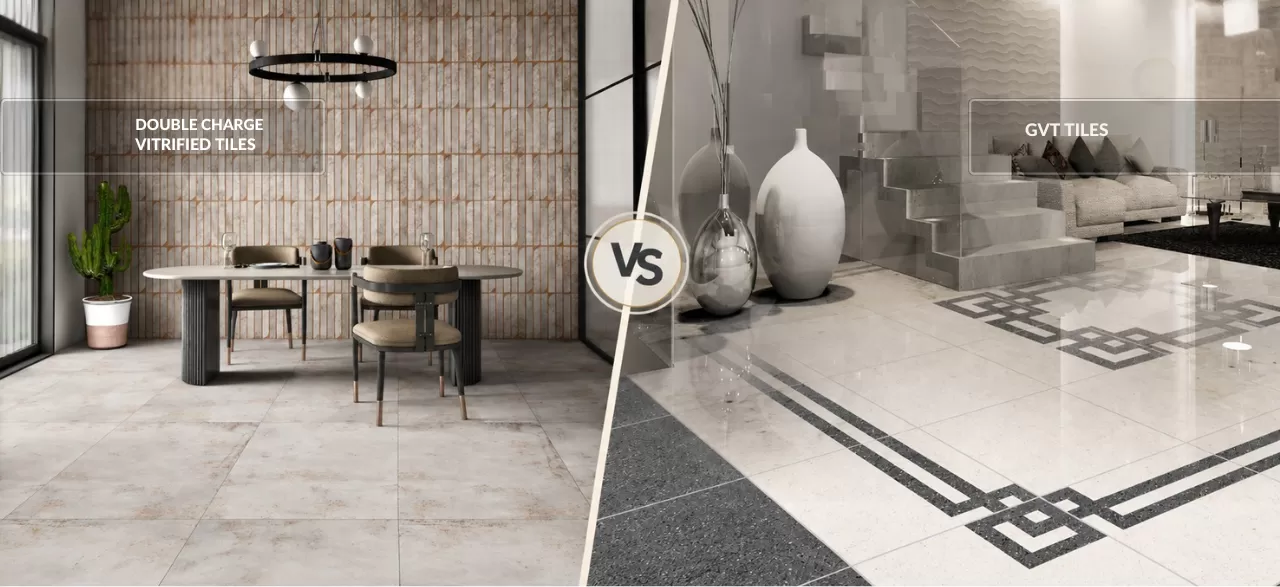
Double Charge Vitrified Tiles vs. GVT Tiles: Which One Should You Choose?
Read Now →
Trending Hall Floor Tile Designs for Modern Interiors
Read Now →
What Are the Most Popular Tile Colours in 2026?
Read Now →
Which Anti Slip Bathroom Tiles Are Best? Matte vs Textured Explained
Read Now →Discover The Latest Kitchen Tile Innovation
Encourage users to explore or contact for bulk/dealer inquiries
View TileLatest Blogs
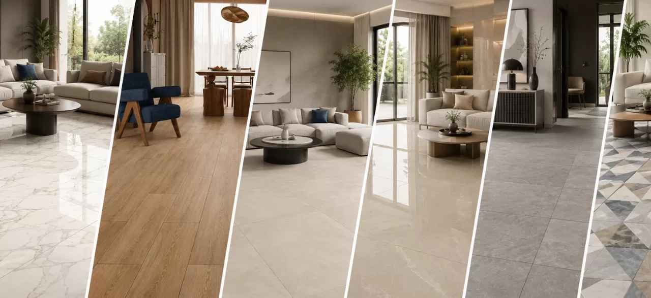
Explore—and shop—these real-life spaces.
Double Charge Vitrified Tiles vs. GVT Tiles: Which One Should You Choose?
When it comes to flooring, your choice of tiles can define both the style and....
Trending Hall Floor Tile Designs for Modern Interiors
The hall is generally the first place that catches the attention of people, as when....
What Are the Most Popular Tile Colours in 2026?
In 2026, tiles are doing more than just covering walls or floors. They are setting....